UI / UX Design
From a 47-step process nobody completed, to a flow that earns trust at every step
Designing an intelligent loan onboarding platform that knows what to ask, when to ask it - and when not to ask at all.
Year :
2025
Industry :
Fin-Tech
Client :
IntelliLend (Fictional)
Project Duration :
6 weeks
Where It Started
When I joined the fintech space, one of the first things I was asked to work on was the loan onboarding flow. And honestly, the moment I saw it, I was quite surprised. It was basically a long form - field after field, no explanation, no sense of progress, no intelligence. Just a wall of inputs that members were expected to fill in and somehow get through.
I started talking to people on the team. Loan officers, the PM, anyone who could tell me what was actually happening on the ground. What I heard was consistent: members were dropping off mid-way. Not because they weren't eligible. Not because they didn't want the loan. Just because the experience was confusing and exhausting.
That was the moment I realised - this isn't a form problem. This is a trust problem.

What I Was Actually Dealing With
Let me tell you what the flow looked like before I touched it.
Every member - whether they were a first-time borrower or someone who had been with the credit union for ten years -saw the exact same form. Same questions, same order, same jargon. "Gross annual income." "Co-applicant." "Debt-to-income ratio." Nobody was explaining what these meant or why we needed them.
And the navigation was painful. If you went back one step to fix something, the form would lose your data. Members were filling in the same fields multiple times. By the time they reached the sensitive financial questions, a lot of them had already given up.
The drop rate was significant. And the loan officers were spending a huge chunk of their time chasing incomplete applications - calling members, re-explaining requirements, trying to collect information that should have been captured upfront.
I could see both sides clearly. That's what made the problem interesting.

The Insight That Changed My Approach
Here is the thing I kept coming back to: most of the information we were asking members to type - we could just pull it.
SSN gives you identity. Credit bureau gives you financial history. The credit union's own system tells you if this person is already a member. Why are we making people fill in what we already know?
So I reframed the problem entirely.
This wasn't about redesigning a form. It was about designing an intelligent data collection engine - one that knows what it already has, fetches what it can from third-party sources, and only asks the member for what it genuinely cannot get any other way.
The smartest onboarding flow is the one that asks the least — because it already knows the most.
That one insight shaped everything that came after.
How I Structured the Product
I broke the product into four modules. Each one handles a specific job - and each one is independently configurable per credit union. This is what makes it SaaS-ready.
Module 1 - Identity and Data Resolution
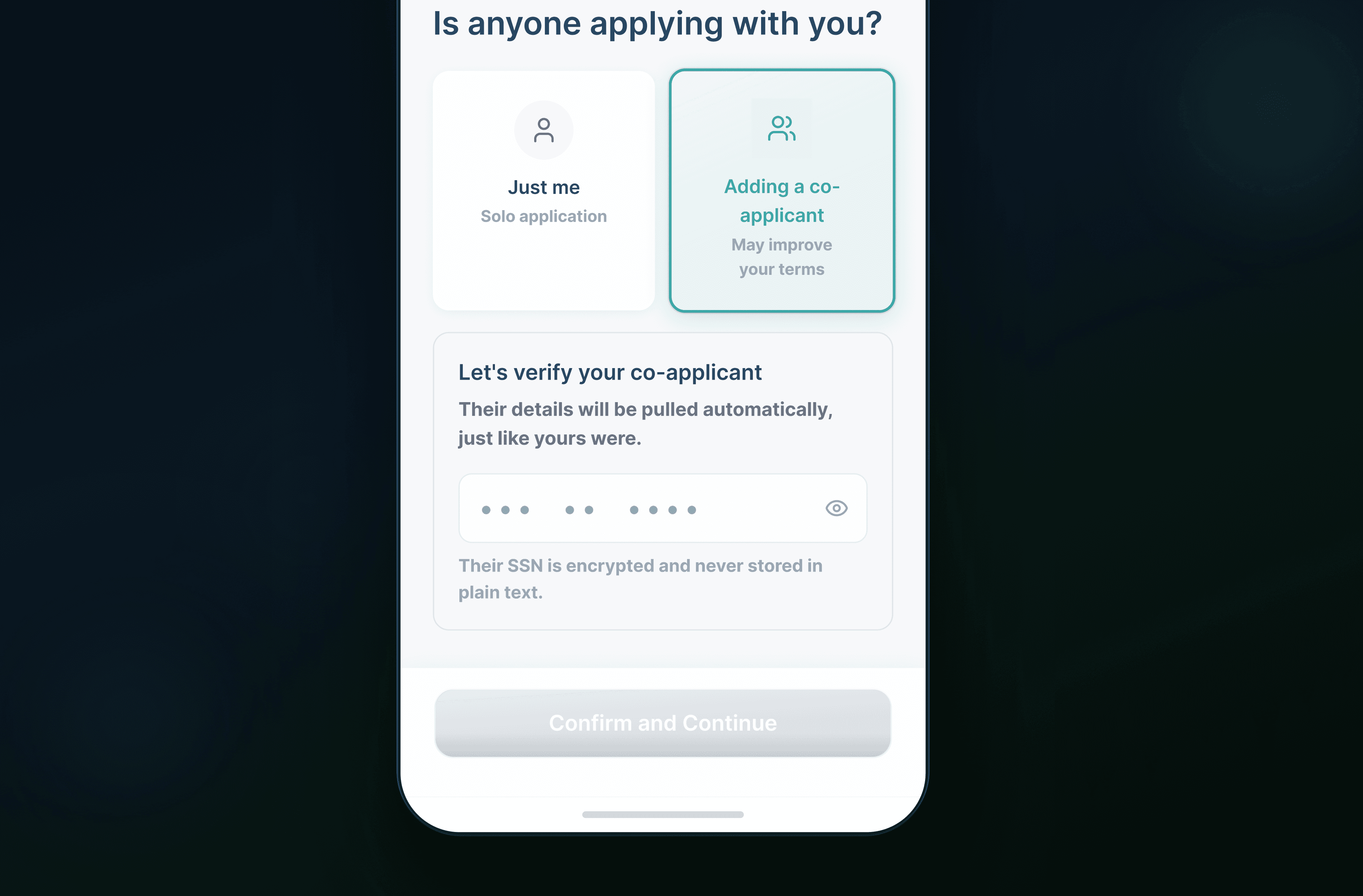
The moment a member enters their SSN, the system gets to work. It pulls identity, checks membership status, and begins credit resolution - all before the member sees a single result. By the time they confirm their details, the system already knows who they are, whether they're an existing member, and what data it still needs.
Members don't type their name. They don't type their address. They just confirm what the system already found. What used to be the most tedious section of any loan application now takes about ten seconds.
Module 2 - Dynamic Question Engine
This is where the real intelligence lives.
Every loan type has a data requirements map - a structured list of everything underwriting needs. The engine runs a continuous gap analysis against this map: what's been collected, what's been pulled automatically, and what's still missing. It only generates questions for genuine gaps.
So if the system already has your income from a connected payroll source, that question doesn't appear. If your credit history shows an existing auto loan, the engine knows to ask about it specifically. Every member gets a different question set because every member has a different data situation.
And it adapts to behaviour too. If a member pauses on a question, or edits their answer multiple times, the system picks that up as a signal. It can surface a plain-language explanation, offer to connect them with an advisor, or simply reorder what comes next. All of this happens invisibly.
Module 3 - Adaptive Gap Resolution
Even with all this intelligence, gaps happen. Income can't always be verified automatically. A co-applicant's identity might not match records. A document might be required that the system can't pull.
Most products handle this with a failure state - an error, a rejection, a dead end. I designed this module specifically to avoid that.
When the engine detects a gap, it identifies the minimum information needed to resolve it, and surfaces exactly that. A targeted upload request. A single clarifying question. Or a handoff to a human advisor - with full context preserved, so the member doesn't have to explain themselves again.
No restarts. No frustration. Just a precise, quiet resolution.
Module 4 - Configuration and Rules Engine
This is the module that makes the product deployable at scale.
Every credit union has different loan products, different eligibility rules, different compliance requirements, and different brand identities. This layer lets them configure all of that without touching the core engine. Loan types, question sets, integration providers, handoff rules, brand tokens - all configurable per credit union.
A new credit union can be onboarded to the platform, fully branded and configured, without any custom design or engineering work. That was the design goal from day one.
The Membership Problem — And How I Solved It
About midway through the project, we hit a scenario that most loan onboarding tools completely ignore.
Credit unions have a prerequisite: before someone can apply for a loan, they need to be a member. And membership isn't instant - it involves an eligibility check, document collection, and manual review. So what happens when someone comes to apply for a loan and they're not a member yet?
The old answer was: send them away. Go sign up for membership over there, come back when you're done. Most people never came back.
I didn't want that. And here is what I realised - the SSN entry point that I was already using for identity resolution is also the perfect moment to check membership status. Silently. Before the member sees any result.
So I designed a silent detection gate. One SSN input. Two paths. The member never feels a fork in the road.
If they're an existing member, the flow continues exactly as designed. If they're new, the product transitions with: "You're just a few steps from your loan."
Not "you need to become a member first." Not an error. Not a redirect. Just a calm, confident reframe - and then the membership flow begins inline, with their loan details preserved throughout.
The loan intent card was my solution to the retention problem. Throughout the entire membership flow - eligibility check, document upload, pending review — a persistent card sits at the top of every screen showing the member exactly what they're working toward. Their loan amount. Their estimated monthly payment. Their chosen term. Always visible. Always motivating.
When membership is approved, they get an SMS or email with a deep link. Tapping it brings them back to a personalised return screen: "Welcome back. Your membership is approved. Here's the loan you were applying for." Everything preserved. One tap to resume.
That moment - the deep link return - was the most important screen I designed in the entire product. It's where all the architecture pays off for the member. And it's the moment that turns what could feel like a frustrating detour into a seamless experience.
The Design System
I built the entire product on a design system architected for multi-brand, multi-mode, and multi-device from day one.
I used Figma variables to handle theming at a token level. Brand colors, typography, spacing, component states - all variable-driven. Switching from one credit union's brand to another is a single token swap. No redesign. No new components.
Every component was mirrored in Storybook with the engineering team. Design tokens implemented as CSS variables, so a brand change in Figma propagates directly into production. No drift. No manual handoff errors.
I also documented every component with usage rules, edge case states, and content guidelines. The team could build from the system without needing me to answer questions for every screen. That was important - I was the only designer on this product.
UI / UX Design
From a 47-step process nobody completed, to a flow that earns trust at every step
Designing an intelligent loan onboarding platform that knows what to ask, when to ask it - and when not to ask at all.
Year :
2025
Industry :
Fin-Tech
Client :
IntelliLend (Fictional)
Project Duration :
6 weeks
Where It Started
When I joined the fintech space, one of the first things I was asked to work on was the loan onboarding flow. And honestly, the moment I saw it, I was quite surprised. It was basically a long form - field after field, no explanation, no sense of progress, no intelligence. Just a wall of inputs that members were expected to fill in and somehow get through.
I started talking to people on the team. Loan officers, the PM, anyone who could tell me what was actually happening on the ground. What I heard was consistent: members were dropping off mid-way. Not because they weren't eligible. Not because they didn't want the loan. Just because the experience was confusing and exhausting.
That was the moment I realised - this isn't a form problem. This is a trust problem.
What I Was Actually Dealing With
Let me tell you what the flow looked like before I touched it.
Every member - whether they were a first-time borrower or someone who had been with the credit union for ten years -saw the exact same form. Same questions, same order, same jargon. "Gross annual income." "Co-applicant." "Debt-to-income ratio." Nobody was explaining what these meant or why we needed them.
And the navigation was painful. If you went back one step to fix something, the form would lose your data. Members were filling in the same fields multiple times. By the time they reached the sensitive financial questions, a lot of them had already given up.
The drop rate was significant. And the loan officers were spending a huge chunk of their time chasing incomplete applications - calling members, re-explaining requirements, trying to collect information that should have been captured upfront.
I could see both sides clearly. That's what made the problem interesting.
The Insight That Changed My Approach
Here is the thing I kept coming back to: most of the information we were asking members to type - we could just pull it.
SSN gives you identity. Credit bureau gives you financial history. The credit union's own system tells you if this person is already a member. Why are we making people fill in what we already know?
So I reframed the problem entirely.
This wasn't about redesigning a form. It was about designing an intelligent data collection engine - one that knows what it already has, fetches what it can from third-party sources, and only asks the member for what it genuinely cannot get any other way.
The smartest onboarding flow is the one that asks the least — because it already knows the most.
That one insight shaped everything that came after.
How I Structured the Product
I broke the product into four modules. Each one handles a specific job - and each one is independently configurable per credit union. This is what makes it SaaS-ready.
Module 1 - Identity and Data Resolution
The moment a member enters their SSN, the system gets to work. It pulls identity, checks membership status, and begins credit resolution - all before the member sees a single result. By the time they confirm their details, the system already knows who they are, whether they're an existing member, and what data it still needs.
Members don't type their name. They don't type their address. They just confirm what the system already found. What used to be the most tedious section of any loan application now takes about ten seconds.
Module 2 - Dynamic Question Engine
This is where the real intelligence lives.
Every loan type has a data requirements map - a structured list of everything underwriting needs. The engine runs a continuous gap analysis against this map: what's been collected, what's been pulled automatically, and what's still missing. It only generates questions for genuine gaps.
So if the system already has your income from a connected payroll source, that question doesn't appear. If your credit history shows an existing auto loan, the engine knows to ask about it specifically. Every member gets a different question set because every member has a different data situation.
And it adapts to behaviour too. If a member pauses on a question, or edits their answer multiple times, the system picks that up as a signal. It can surface a plain-language explanation, offer to connect them with an advisor, or simply reorder what comes next. All of this happens invisibly.
Module 3 - Adaptive Gap Resolution
Even with all this intelligence, gaps happen. Income can't always be verified automatically. A co-applicant's identity might not match records. A document might be required that the system can't pull.
Most products handle this with a failure state - an error, a rejection, a dead end. I designed this module specifically to avoid that.
When the engine detects a gap, it identifies the minimum information needed to resolve it, and surfaces exactly that. A targeted upload request. A single clarifying question. Or a handoff to a human advisor - with full context preserved, so the member doesn't have to explain themselves again.
No restarts. No frustration. Just a precise, quiet resolution.
Module 4 - Configuration and Rules Engine
This is the module that makes the product deployable at scale.
Every credit union has different loan products, different eligibility rules, different compliance requirements, and different brand identities. This layer lets them configure all of that without touching the core engine. Loan types, question sets, integration providers, handoff rules, brand tokens - all configurable per credit union.
A new credit union can be onboarded to the platform, fully branded and configured, without any custom design or engineering work. That was the design goal from day one.
The Membership Problem — And How I Solved It
About midway through the project, we hit a scenario that most loan onboarding tools completely ignore.
Credit unions have a prerequisite: before someone can apply for a loan, they need to be a member. And membership isn't instant - it involves an eligibility check, document collection, and manual review. So what happens when someone comes to apply for a loan and they're not a member yet?
The old answer was: send them away. Go sign up for membership over there, come back when you're done. Most people never came back.
I didn't want that. And here is what I realised - the SSN entry point that I was already using for identity resolution is also the perfect moment to check membership status. Silently. Before the member sees any result.
So I designed a silent detection gate. One SSN input. Two paths. The member never feels a fork in the road.
If they're an existing member, the flow continues exactly as designed. If they're new, the product transitions with: "You're just a few steps from your loan."
Not "you need to become a member first." Not an error. Not a redirect. Just a calm, confident reframe - and then the membership flow begins inline, with their loan details preserved throughout.
The loan intent card was my solution to the retention problem. Throughout the entire membership flow - eligibility check, document upload, pending review — a persistent card sits at the top of every screen showing the member exactly what they're working toward. Their loan amount. Their estimated monthly payment. Their chosen term. Always visible. Always motivating.
When membership is approved, they get an SMS or email with a deep link. Tapping it brings them back to a personalised return screen: "Welcome back. Your membership is approved. Here's the loan you were applying for." Everything preserved. One tap to resume.
That moment - the deep link return - was the most important screen I designed in the entire product. It's where all the architecture pays off for the member. And it's the moment that turns what could feel like a frustrating detour into a seamless experience.
The Design System
I built the entire product on a design system architected for multi-brand, multi-mode, and multi-device from day one.
I used Figma variables to handle theming at a token level. Brand colors, typography, spacing, component states - all variable-driven. Switching from one credit union's brand to another is a single token swap. No redesign. No new components.
Every component was mirrored in Storybook with the engineering team. Design tokens implemented as CSS variables, so a brand change in Figma propagates directly into production. No drift. No manual handoff errors.
I also documented every component with usage rules, edge case states, and content guidelines. The team could build from the system without needing me to answer questions for every screen. That was important - I was the only designer on this product.
UI / UX Design
From a 47-step process nobody completed, to a flow that earns trust at every step
Designing an intelligent loan onboarding platform that knows what to ask, when to ask it - and when not to ask at all.
Year :
2025
Industry :
Fin-Tech
Client :
IntelliLend (Fictional)
Project Duration :
6 weeks
Where It Started
When I joined the fintech space, one of the first things I was asked to work on was the loan onboarding flow. And honestly, the moment I saw it, I was quite surprised. It was basically a long form - field after field, no explanation, no sense of progress, no intelligence. Just a wall of inputs that members were expected to fill in and somehow get through.
I started talking to people on the team. Loan officers, the PM, anyone who could tell me what was actually happening on the ground. What I heard was consistent: members were dropping off mid-way. Not because they weren't eligible. Not because they didn't want the loan. Just because the experience was confusing and exhausting.
That was the moment I realised - this isn't a form problem. This is a trust problem.
What I Was Actually Dealing With
Let me tell you what the flow looked like before I touched it.
Every member - whether they were a first-time borrower or someone who had been with the credit union for ten years -saw the exact same form. Same questions, same order, same jargon. "Gross annual income." "Co-applicant." "Debt-to-income ratio." Nobody was explaining what these meant or why we needed them.
And the navigation was painful. If you went back one step to fix something, the form would lose your data. Members were filling in the same fields multiple times. By the time they reached the sensitive financial questions, a lot of them had already given up.
The drop rate was significant. And the loan officers were spending a huge chunk of their time chasing incomplete applications - calling members, re-explaining requirements, trying to collect information that should have been captured upfront.
I could see both sides clearly. That's what made the problem interesting.
The Insight That Changed My Approach
Here is the thing I kept coming back to: most of the information we were asking members to type - we could just pull it.
SSN gives you identity. Credit bureau gives you financial history. The credit union's own system tells you if this person is already a member. Why are we making people fill in what we already know?
So I reframed the problem entirely.
This wasn't about redesigning a form. It was about designing an intelligent data collection engine - one that knows what it already has, fetches what it can from third-party sources, and only asks the member for what it genuinely cannot get any other way.
The smartest onboarding flow is the one that asks the least — because it already knows the most.
That one insight shaped everything that came after.
How I Structured the Product
I broke the product into four modules. Each one handles a specific job - and each one is independently configurable per credit union. This is what makes it SaaS-ready.
Module 1 - Identity and Data Resolution
The moment a member enters their SSN, the system gets to work. It pulls identity, checks membership status, and begins credit resolution - all before the member sees a single result. By the time they confirm their details, the system already knows who they are, whether they're an existing member, and what data it still needs.
Members don't type their name. They don't type their address. They just confirm what the system already found. What used to be the most tedious section of any loan application now takes about ten seconds.
Module 2 - Dynamic Question Engine
This is where the real intelligence lives.
Every loan type has a data requirements map - a structured list of everything underwriting needs. The engine runs a continuous gap analysis against this map: what's been collected, what's been pulled automatically, and what's still missing. It only generates questions for genuine gaps.
So if the system already has your income from a connected payroll source, that question doesn't appear. If your credit history shows an existing auto loan, the engine knows to ask about it specifically. Every member gets a different question set because every member has a different data situation.
And it adapts to behaviour too. If a member pauses on a question, or edits their answer multiple times, the system picks that up as a signal. It can surface a plain-language explanation, offer to connect them with an advisor, or simply reorder what comes next. All of this happens invisibly.
Module 3 - Adaptive Gap Resolution
Even with all this intelligence, gaps happen. Income can't always be verified automatically. A co-applicant's identity might not match records. A document might be required that the system can't pull.
Most products handle this with a failure state - an error, a rejection, a dead end. I designed this module specifically to avoid that.
When the engine detects a gap, it identifies the minimum information needed to resolve it, and surfaces exactly that. A targeted upload request. A single clarifying question. Or a handoff to a human advisor - with full context preserved, so the member doesn't have to explain themselves again.
No restarts. No frustration. Just a precise, quiet resolution.
Module 4 - Configuration and Rules Engine
This is the module that makes the product deployable at scale.
Every credit union has different loan products, different eligibility rules, different compliance requirements, and different brand identities. This layer lets them configure all of that without touching the core engine. Loan types, question sets, integration providers, handoff rules, brand tokens - all configurable per credit union.
A new credit union can be onboarded to the platform, fully branded and configured, without any custom design or engineering work. That was the design goal from day one.
The Membership Problem — And How I Solved It
About midway through the project, we hit a scenario that most loan onboarding tools completely ignore.
Credit unions have a prerequisite: before someone can apply for a loan, they need to be a member. And membership isn't instant - it involves an eligibility check, document collection, and manual review. So what happens when someone comes to apply for a loan and they're not a member yet?
The old answer was: send them away. Go sign up for membership over there, come back when you're done. Most people never came back.
I didn't want that. And here is what I realised - the SSN entry point that I was already using for identity resolution is also the perfect moment to check membership status. Silently. Before the member sees any result.
So I designed a silent detection gate. One SSN input. Two paths. The member never feels a fork in the road.
If they're an existing member, the flow continues exactly as designed. If they're new, the product transitions with: "You're just a few steps from your loan."
Not "you need to become a member first." Not an error. Not a redirect. Just a calm, confident reframe - and then the membership flow begins inline, with their loan details preserved throughout.
The loan intent card was my solution to the retention problem. Throughout the entire membership flow - eligibility check, document upload, pending review — a persistent card sits at the top of every screen showing the member exactly what they're working toward. Their loan amount. Their estimated monthly payment. Their chosen term. Always visible. Always motivating.
When membership is approved, they get an SMS or email with a deep link. Tapping it brings them back to a personalised return screen: "Welcome back. Your membership is approved. Here's the loan you were applying for." Everything preserved. One tap to resume.
That moment - the deep link return - was the most important screen I designed in the entire product. It's where all the architecture pays off for the member. And it's the moment that turns what could feel like a frustrating detour into a seamless experience.
The Design System
I built the entire product on a design system architected for multi-brand, multi-mode, and multi-device from day one.
I used Figma variables to handle theming at a token level. Brand colors, typography, spacing, component states - all variable-driven. Switching from one credit union's brand to another is a single token swap. No redesign. No new components.
Every component was mirrored in Storybook with the engineering team. Design tokens implemented as CSS variables, so a brand change in Figma propagates directly into production. No drift. No manual handoff errors.
I also documented every component with usage rules, edge case states, and content guidelines. The team could build from the system without needing me to answer questions for every screen. That was important - I was the only designer on this product.